The BECOME Project
BECOME is a fitness and well-being platform that strives to deliver high-quality written content to their readers with the ambition to encourage people to live a healthier and more active lifestyle.

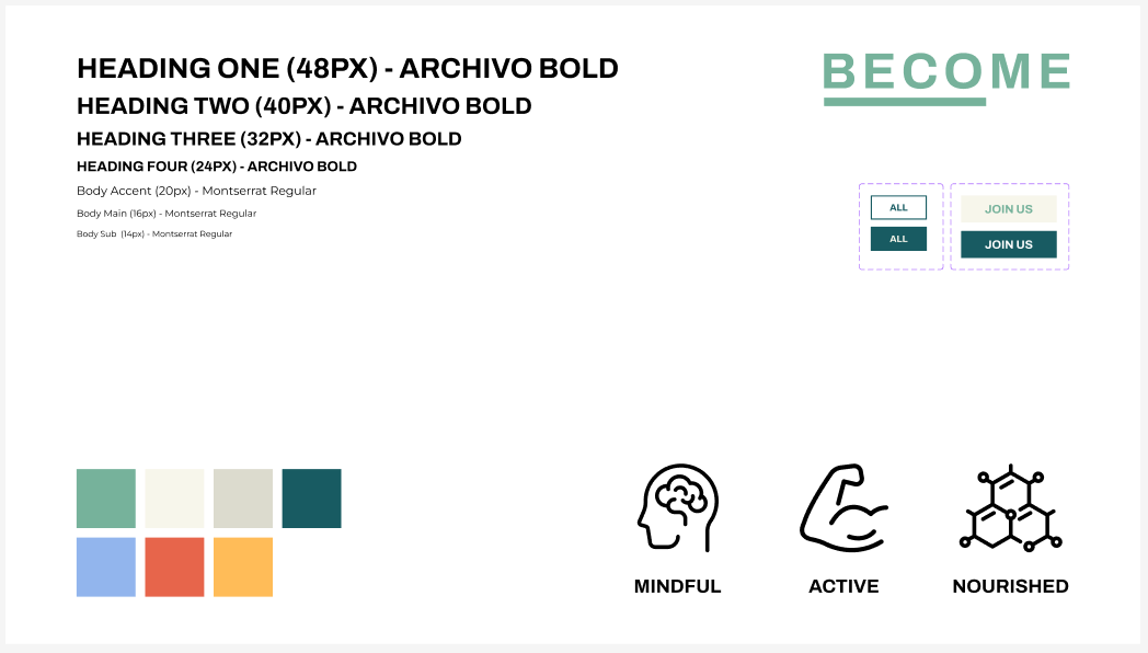
BECOME branding references
The Challenge
The team behind BECOME have had little experience in the digital world, with this project being their first steps into independently selling their expertise. The start-up company approached us having the expertise of delivering a quality product without the know-how to get it the service out there.
My task was to deliver a visually striking design for the homepage of their website. The purpose of the website would be to raise awareness of the importance of an active lifestyle, representing the benefits of BECOME and ultimately driving conversions in the form of sign-ups.
Research & Discovery
The client approached us with a list of competitors that they had been inspired by, highlighting the aspects of the websites that they liked and disliked along with their vision on how they wanted to differentiate BECOME from the competition.
A comprehensive meeting with the client revealed their target market to be young adult women with an interest in fitness looking to further their training regimes or receive support to keep on track. This gave me a clear direction on how I should be designing the website, giving me insight on the type of wording and photography I should be using along with the best devices to optimise the design to.
Proceeding the client meeting, I conducted my own independent market research on the list of competitors I had been given, I was looking closely at how these sites were advertising their services and the tone of voice they implemented.
I took design inspiration from multiple sources and when I had a strong feel on how I envisioned BECOME to look, feel and function I was ready to get to work.

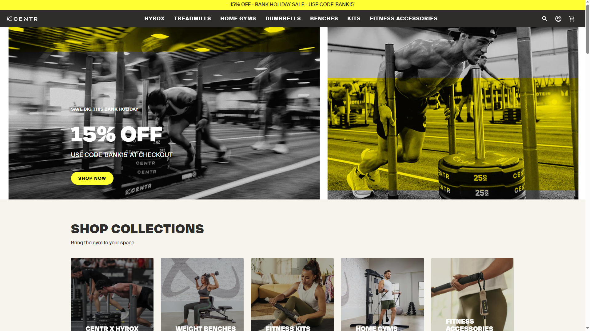
One of the client’s favourite websites, Centr – key inspiration

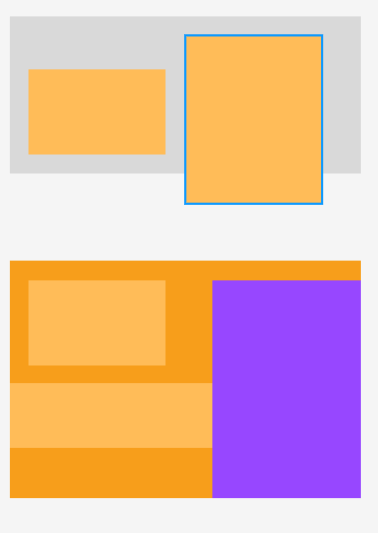
Low-fidelity initial mock-ups of the home page.
Design Process
I used my choice of UX/UI software, Figma, to create this design. To begin with, I created an asset panel on the design, were I collated all the fonts, colours and buttons that I was going to use through-out the design. I had been given a branding document containing the colours BECOME wished to use, along with their logo. From this I chose a selection of relevant typefaces that would resonate with the feel of the site and appeal to the target audience.
Initially, I created a low-fidelity mock-up initially to plan the layout of the design. A strong factor I had to work around was the client’s request of a modern and minimalistic design that wasn’t too blocky or clunky. At first, I made note of what sections I wanted representing throughout the homepage and highlighted the general order and areas I wanted these to be shown.
I then plotted out where each call to action, image and text block would go in such a way that users would always have the prompt to sign-up whenever they scrolled into a new section. Although I was using columns to keep the design neat, I still kept in mind the request to keep the design more open, giving each section a lot of white space and incorporating asymmetrical elements throughout.
Once I had the low-fidelity wireframe created in such a way I was happy with, I moved onto looking to populate these areas with stunning imagery and design elements. I had a small selection of imagery that I had collated during the initial meeting for a mood board that I planned to use, along with additional images that I could source from royalty free photo libraries such as Pexels.
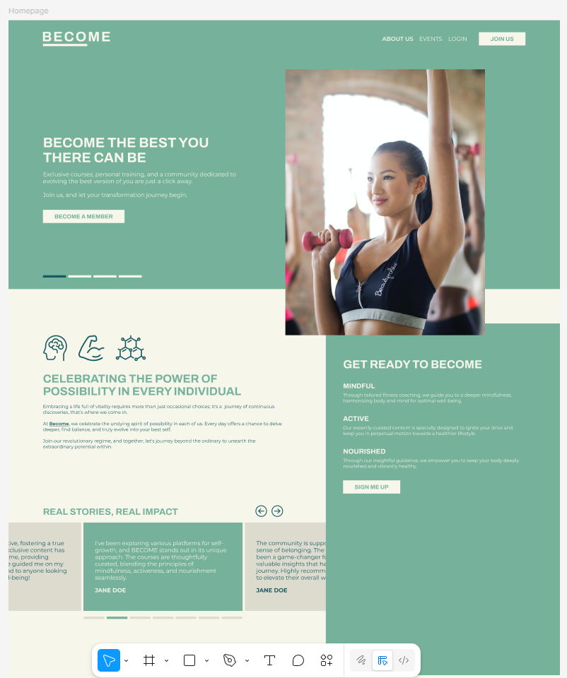
I fleshed out each section of the homepage with images, iconography and AI-generated content that a copywriter would review and update at a future date. I took careful consideration in developing each section, making sure the colours and layout drew the eyes of users to the places I wanted them to be. I kept consistency throughout the design so it felt fluid and inviting, with each section gracefully blending into the next.
The Results
I personally felt satisfied with the final results of the design, believing I had met the brief exactly to specification and had blown this project out of water. I was aware however that this design had to go through multiple different directors to receive sign-off before my work was done.
I passed the design to my project leader and explained to them the animation plans and flow I envisioned within the design. My project lead reviewed the design and had only positive feedback to give me, with no changes from themselves.
Often, I expect to receive a list of amendments as revising a design is a natural part of the process in most cases, especially when there is a lot of people involved. In this case however, when I received word from the BECOME team, they were extremely pleased with the design I had delivered, stating it had gone above and beyond their expectations and ultimately, they were extremely pleased.
Originally the BECOME team had only planned to have a design of their homepage completed but upon review of the quality of work we had delivered, they decided they also wanted each landing page given a custom design, winning us further work in the future.

Above-the-fold view of BECOME followed by intro section.
